Form Creator
The form creator allows you to collect information from your website visitors. Please note, forms cannot be used to collect credit card numbers or other types of payment information.
Creating a Form
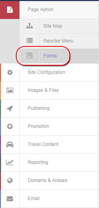
To create a form to use on your NexCite, select Page Admin and then Forms from the administrative portal:
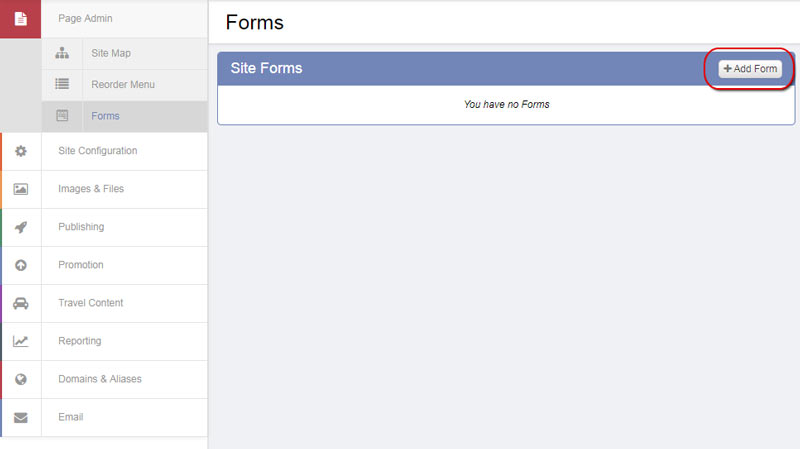
Select the Add Form button:
Fill in the applicable form fields:
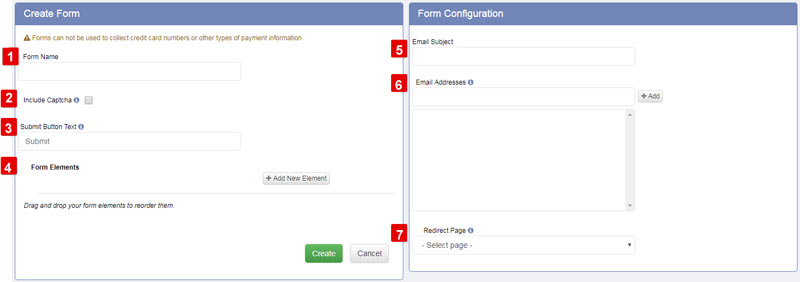
- Form Name: The internal name for your form. This will not show to your customers but is to help you identify your forms.
- Include Captcha: Checking this box will require users to select a color before submitting the form. This acts as a deterrent against spambots.
- Submit Button Text: This will be the text that displays on the submit button for your form. The default is "Submit."
- Form Elements: For a full explanation of the Form Elements, please click here or see below.
- Email Subject: The subject line of the email that will be sent containing the results of the form.
- Email Addresses: The email that form results will be sent to. After entering an email, select the Add button. You may add multiple email addresses.
- Form submission action
- Redirect Page: After the form is submitted, you can select the page you'd like the user to redirect to. You may want to create a "Thank You" page and give them a frame as to when they can expect a response, as an example, or you can redirect them to your home page.
- Form Confirmation Message: After the form is submitted, you can create a message you would like teh user to be shown. You may want to create a "Thank You" message and give them a time frame as to when they can expect a response, as an example.
Form Elements
When creating a form, you'll be able to add different form elements to collect information.
Select from the available elements below to jump to instructions on how to use that element:
- Checkbox
- Date/Time
- Dropdown
- Dropdown: Agency Office
- Dropdown: Agent
- Dropdown: Country
- Dropdown: State/Province
- Dropdown: Supplier
- Email Address
- Radio Button
- Textbox
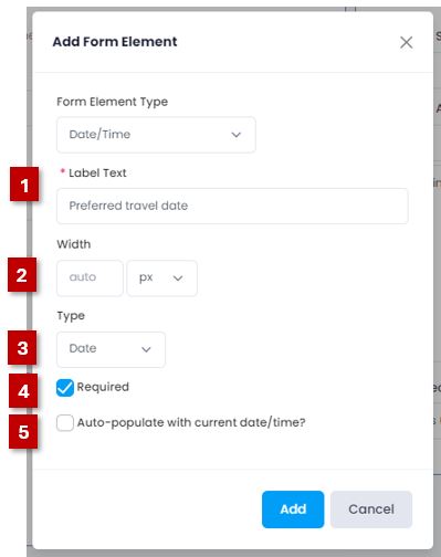
Below each form there are two images - one shows what the form element options look like when you first select them, the second image shows what options were set in the example form shown at the bottom of this page.
Checkbox
This element allows you to create different options for your customer to select from - customers can select multiple boxes.
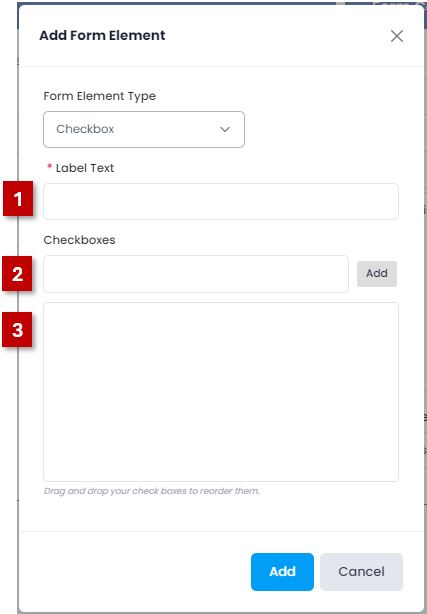
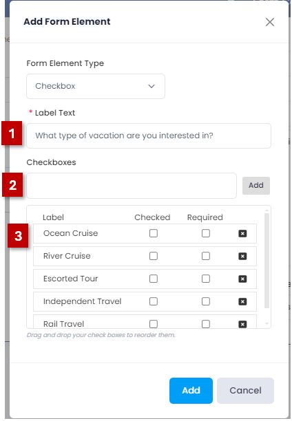
- Label Text: What the field will be called on the form.
- Checkboxes: Enter the text for the checkboxes you would like your customer to choose from. After entering the text, select the Add button, which will move the checkbox down. Continue to enter the text and select the Add button until you have entered all of the checkboxes you would like available for your customer.
- This area will display the different checkboxes you've added. You can drag and drop them to reorder them, select the box under the "Checked" column to set boxes to be pre-checked, select the box under the "Required" column to make the specific selection required, or select the X to remove any of the checkboxes you've added.
Date/Time
This element adds a Date or Date and Time picker field to your form:
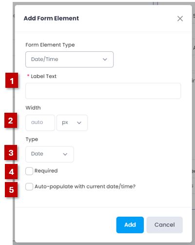
- Label Text: What the field will be called on the form.
- Width: This is used to set the width of the field. A static pixel (px) can be used, or it can be changed to a percertage.
- Type:
- Date: This will allow the customer to select a date to input to the field.
- Date/Time:This will allow the customer to select a date and time to input to the field.
- Required: Check this box to require a selection to be made on this element to submit the form.
- Auto-populate with current date/time? If this is checked, the date/time field on your form will be auto-filled with the current date (and time if the Date/Time type has been selected).
Dropdown
This element allows you to create different options for your customer to select from using a drop-down selection - customers can select multiple options.
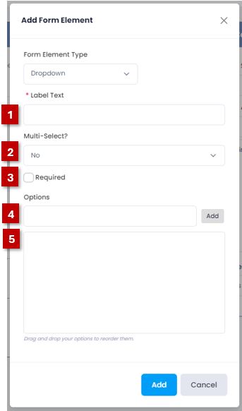
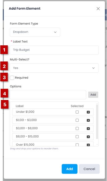
- Label Text: What the field will be called on the form.
- Multi-Select?: Select "Yes" if you want a customer to be able to select more than one option (it will default to "No").
- Required: Check this box to require a selection to be made on this element to submit the form.
- Options: Enter the text for the selections you would like your customer to choose from. After entering the text, select the Add button, which will move the option down. Continue to enter the text and select the Add button until you have entered all of the options you would like available for your customer.
- This area will display the different options you've added. You can drag and drop them to reorder them, select the box under the Selected column to set options as pre-selected, or select the X to remove any of the options you've added.
Dropdown: Agency Office
This element allows you to display a drop-down of different offices for your customer to choose from.
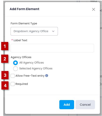
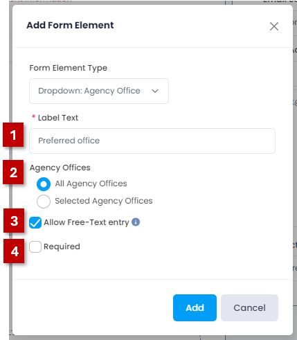
- Label Text: What the field will be called on the form.
- Agency Offices:
- All Agency Offices: This will display all agency offices that have been created in your Lead Management.
- Selected Agency Offices: This will allow you to select which of the agency offices that have been created in your Lead Management to display.
- Allow Free-Text entry: This will allow your customers to be able to type in agency offices that are not already included in the list
- Required: Check this box to require a selection to be made on this element to submit the form.
Dropdown: Agent
This element allows you to display a drop-down of different agents for your customer to choose from.


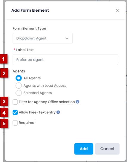
- Label Text: What the field will be called on the form.
- Agents:
- All Agents: This will display all agents that have AgentPort accounts created.
- Agents with Lead Access: This will allow you to display only the agents that have been granted lead access. This can be set in the Lead Management area .
- Selected Agents:
- Allow Free-Text entry: This will allow your customers to be able to type in agency offices that are not already included in the list
- Required: Check this box to require a selection to be made on this element to submit the form.
Dropdown: Country
This element creates a dropdown menu of countries to select from.
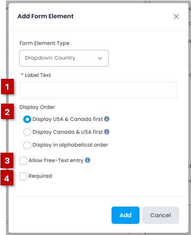
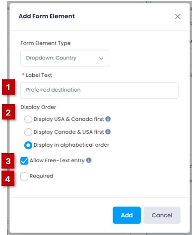
- Label Text: What the field will be called on the form.
- Display Order:
- Display USA & Canada first: This will display the dropdown list of countries with USA showing first, Canada second, and the rest of the countries in alphabetical order after.
- Display Canada & USA first: This will display the dropdown list of countries with Canada showing first, USA second, and the rest of the countries in alphabetical order after.
- Display in alphabetical order: This will display all countries showing in alphabetical order.
- Allow Free-Text entry: This will allow your customers to be able to type in locations not listed.
- Required: Check this box to require a selection to be made on this element to submit the form.
Dropdown: State/Province
This element creates a dropdown menu of states or provinces to select from.
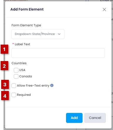
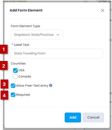
- Label Text: What the field will be called on the form.
- Countries:
- USA: Selecting this option will provide US states in the form dropdown.
- Canada: Selecting this option will provide Canadian provinces in the form dropdown.
- Allow Free-Text entry: This will allow your customers to be able to type in locations not listed.
- Required: Check this box to require a selection to be made on this element to submit the form.
Dropdown: Supplier
This element creates a dropdown menu of suppliers to select from.
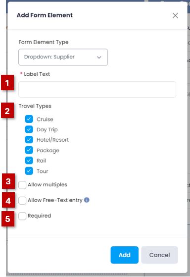
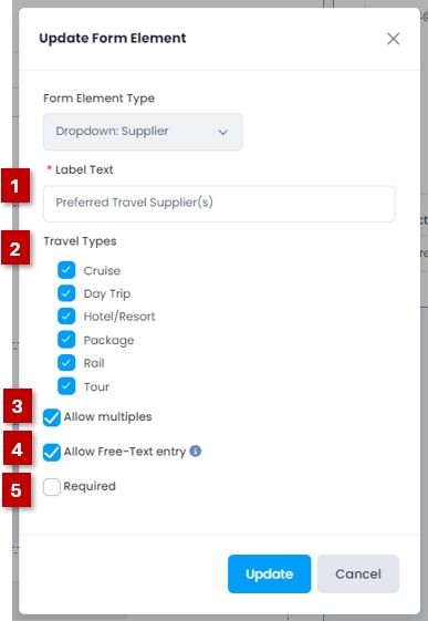
- Label Text: What the field will be called on the form.
- Travel Types: Check the box(es) of which types of travel to display supplier options from.
- Allow multiples: When checked, this will allow your customer to select multiple suppliers.
- Allow Free-Text entry: This will allow your customers to be able to type in suppliers not listed.
- Required: Check this box to require a selection to be made on this element to submit the form.
Email Address
This element creates a field for a customer to enter in their email address.
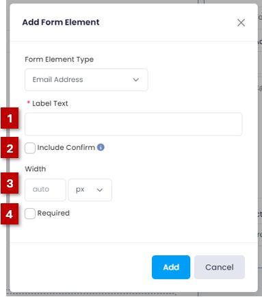
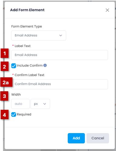
- Label Text: What the field will be called on the form.
- Include Confirm: Check this box to add an additional field to confirm the email address.
- 2a. Confirm Label Text: What the confirm field will be called on the form.
- Width: This is used to set the width of the field. A static pixel (px) can be used, or it can be changed to a percertage.
- Required: Check this box to require a selection to be made on this element to submit the form.
Radio Button
This element allows you to create different options for your customer to fill in a bubble for.
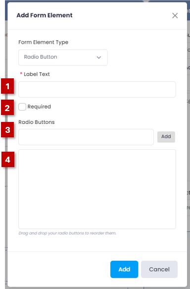
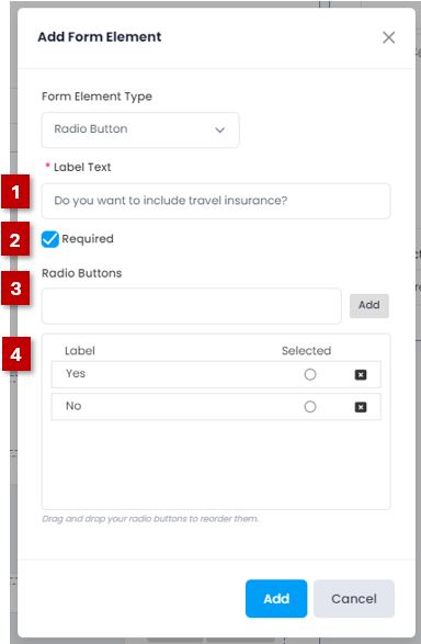
- Label Text: What the field will be called on the form
- Required: Check this box to require a selection to be made to submit the form.
- Radio Buttons: Enter the text for the selections you would like your customer to choose from. After entering the text, select the Add button, which will move the option down. Continue to enter the text and select the Add button until you have entered all the options you would like available for your customer.
- This area will display the different options you've added. You can drag and drop them to reorder them, select the circle under the Selected column set options as pre-selected, or select the X to remove any of the options you've added.
Textbox
This element allows you to create a field for your customer to type into.
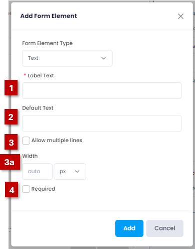

- Label Text: What the field will be called on the form
- Default Text: Default text will show in the text field on your form before your site visitor enters anything in. It can be used to give them more information about how they should be filling out the textbox.
- Allow multiple lines: Checking this box will allow a customer to write multiple lines of text in the text field.
- 3a. Width: This is used to set the width of the field. A static pixel (px) can be used, or it can be changed to a percentage.
- 3b. Height: This is used to set the height of the field using a static pixel (px) value.
- Width: The width can be adjusted to either a static pixel (px) width or set to a percentage.
- Required: (not shown) Check this box to require that something is entered into this field to submit the form.
Demo Travel Profile Form
* Please note that this form is meant for demonstration purposes only. Please do not submit it.
Adding a Form to a Page
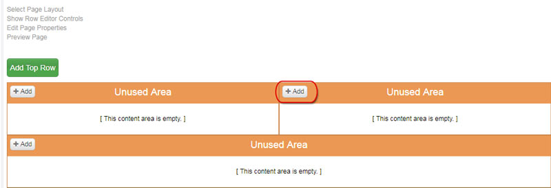
In order to add a Form to a page, you'll need to have an Unused Area you can assign it to. You can add more Unused Areas to an existing page by changing the page layout to one that includes more sections, or adding a row. Select "Add" on the Unused Area you'd like the form to show on:
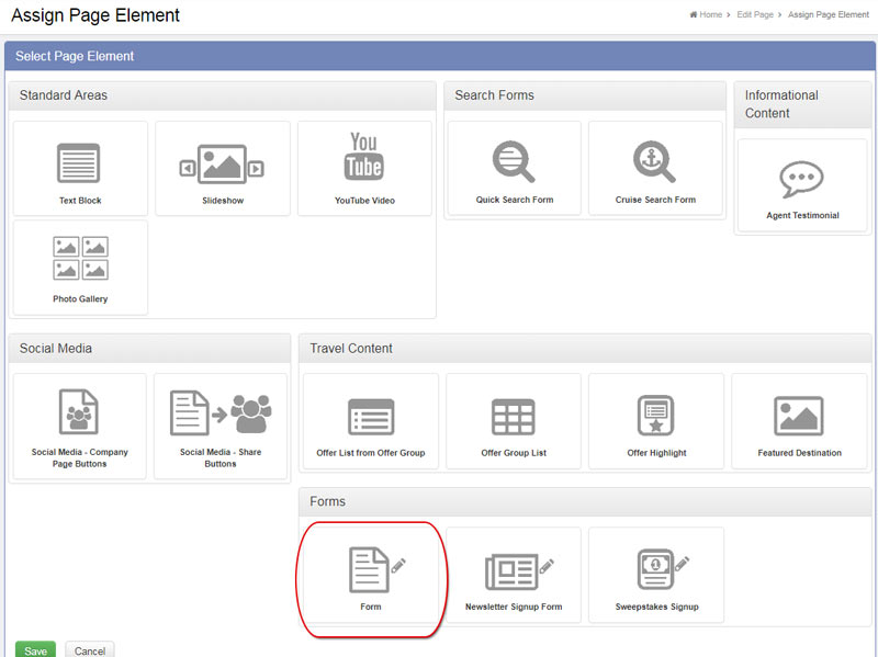
Select "Form" from the page element selection and hit save:
When adding a form to a section, you'll be able to add the following settings:

- Title: The title of your form. This will show at the top of it.
- Form: Select from the forms you've created.
- Alignment: Set the alignment of the form within the page section.
- Width: You can set the width as either a percentage or a static pixel size.
- Padding: This will set the space around the form.
- Spacing: This is the amount of space between the form elements
- Background Color: Use this to set a background color to the form.
Once you've added your form, be sure to publish your changes to the page and the form you created to have them show on your live site.