Cards Component
The Cards Component provides an option to display text overlayed on a background image with hover-over interaction.
Here is an example:
Example Cards

We'll never let you get lost when you use us! Our constant communication and in-depth destination knowledge let you relax and know you're in good hands.

Ask us about our adventure trips! We love our active adventures and often have groups available for hiking, biking, kayaking, and more for the outdoor enthusiasts!

For those extra special vacation moments, we can't speak highly enough of our on-location photography services. We'll coordinate a local photographer to help capture your dream trip.
European Wine River Cruises offer a relaxing way to explore renowned wine regions, with vineyard tours, tastings, and scenic river sailing—all curated for wine lovers.
Add the Card Content
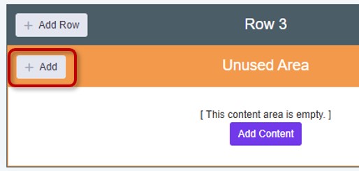
Navigate to an Unused Area on your site and click the + Add button in the top left, or the Add Content button in the middle:
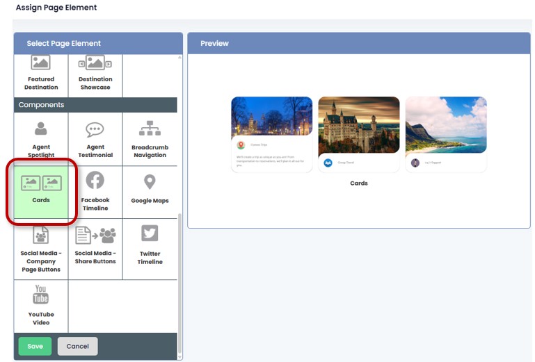
Select the Cards page element within the components section:
Configure the Card Properties
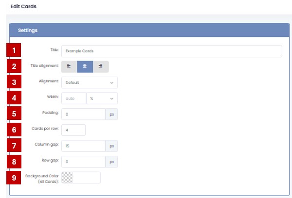
- Title: Enter a name for this card set (e.g., “Example Cards”). The title will show above the cards.
- Title Alignment: Choose how the title aligns: left, center, or right.
- Alignment: Choose card alignment within the container.
- Width: Define card container width in % or pixels.
- Padding: Space around the card content.
- Cards per row: Set how many cards are displayed per row (e.g., 4).
- Column Gap: Set spacing between columns of cards.
- Row Gap: Set spacing between rows of cards.
- Background Color:Set a background color for the full card section.
Add and Manage Cards
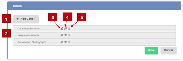
- Add Card: Click + Add Card to create a new card.
- Card List: Each card is listed by name after being added.
- Edit Icon: Click the pencil icon to open the card for editing.
- Link Icon: Click to add or modify a hyperlink associated with the card.
- Delete Icon: Click the trash can to remove the card.
Edit Card Properties
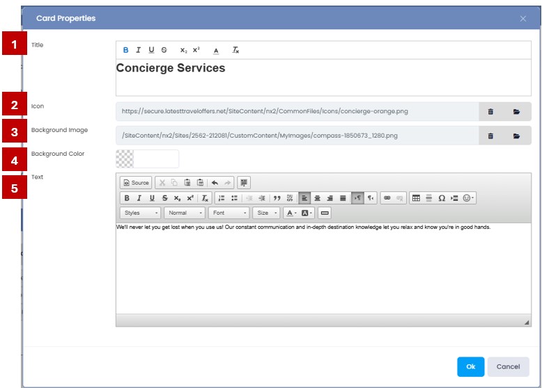
- Title: Enter the name of the card (e.g., “Concierge Services”). This appears as the card’s headline.
- Icon: Select the folder icon to go to your Images and Files, where you can select the icon image you want to use. (We have icons for you to choose from! Look for the icons folder
 )
) - Background Image: Select the folder icon to go to your Images and Files, where you can select the image that will fill the background of the card.
- Background Color: The default color of the card background will be white, but you can select a different color here.
- Text: Use the rich text editor to enter and format your card’s content, such as descriptions, bold text, links, or bullet points.
💡 Tips
Use consistent image sizes for icons and background images.
Make sure your text is clear and concise for quick scanning.